Genesis: The Design in the Design.

“In the beginning, God created the heavens and the earth.” – Genesis 1:1
When you hear “Genesis” what do you see? Do you see a garden with Adam and Eve in leaf briefs, befriending serpents like “Sir Hiss” in the classic 1973 Disney film “Robin Hood.” Noah’s Ark portrayed as a floating zoo, (meanwhile, God was destroying the rest of humanity), or maybe you think of Joseph and his “Amazing Technicolor Dreamcoat.” There are so many images living inside us. These cultural cues shape our imagination for how we read and see God’s Word. Some are helpful, some harmful.
When I was tasked with the branding (visual identity) for Genesis, it led me to think about Genesis in a new light. What is Genesis actually telling us? There are a lot of sub-stories in Genesis and so I didn’t want to create imagery that would turn us away from the main story. Genesis is, for us, Act I. It’s in Genesis that we are introduced to the Grand Story we are in and what role we will play; and God is the one who is setting the stage for us. He is the Author and the Hero in which all the other characters and subplots point to. He is the Promise-Maker and the Promise-Keeper, the Beginning and the End, the Creator and the Redeemer. It’s important that the images we attach to the book of Genesis (or any of our doctrine and theology) stir our imagination to be filled with the story of God, not manipulate it.
Disclaimer: Everything means something, but some things don’t have to mean everything. It’s important when approaching creation and culture to ask, what does this tell me about God, His character or His story? Or what does it reveal in me and my need for Jesus? It is far less important to ask “why did the artist do it this way?” Though, it can be of some insight to learn an artist’s perspective in the same way a commentary might help you understand certain truths of scripture. That’s how we want to approach this artwork. How does it help you dream of God and His story? How does it illuminate God’s word?

We decided that with such a long series that we should split it up into sections. The problem with this is that whatever concept I came up with, it would need to be flexible and open enough to allow us to grow into it, but still with direction and purpose. The hope of what it will become, not just what I intend for it to be. It had to be a living adaptation. I knew where I wanted to start, but where would it go?
I began to look at Genesis in the light of this “Act 1” concept, and split it up into four major themes, the initiation of God (In the beginning-with God), the introduction of man (creation of man-with God), the broken relationship between God and Man (fall of man-away from God), and the hope of reconciliation (covenant renewal of all things-with God). This helped to give better direction for each portrait. I was fairly dedicated at this point to not show any action or movement in any individual design, but wanted to allow the movement to rise throughout a series of designs. So you might not get a sense of what’s happening in each frame, but when viewed together your imagination would begin to fill the space with the scriptures and see a more vivid picture of God’s redemptive story and plan. God’s presence and faithfulness are marked by the overwhelming beauty and majesty of creation in each graphic. It was important to show the steadfast love of God in each scene. And if you notice, even in the brokenness of man (in graphic 3), in all the darkness and solitude, there’s a lit path that leads back to the open skies to remind us of God’s presence, faithfulness, and steadfast love to see us through. Even in our brokenness, God is present and active in bringing new life.
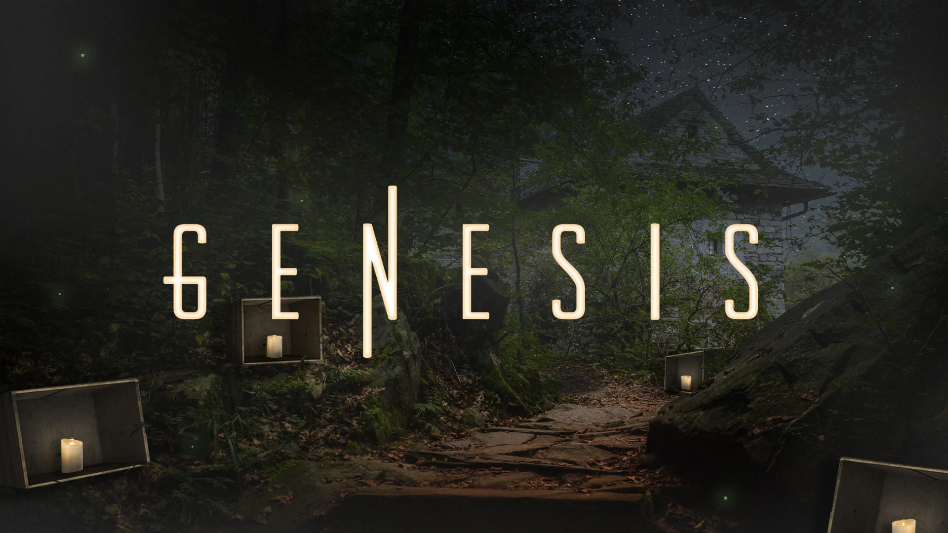
With the logo, I was able to be a little more straightforward in my approach. I wanted to customize a typeface that would push our thoughts towards eternity. It’s easy to read Genesis and see the past, but what about the future? Where do we turn our eyes now in the present? Going with a soft sans-serif font gives a futuristic or galactic appearance, and the extended arms of the letter “N” show the interaction between heaven and earth. It suggests that there is more to the picture than what you see, leading your imagination to wonder and awe at our God who is over all things, and out of His love for us is making all things new.

Matt Shelton
Pastor of Music & Arts at The Paradox Church
SUGGESTED LISTENING:
Tomorrowland (2015) Soundtrack